
Get a free career consultation with our experts
It is more critical than ever in this connected world that websites are accessible and do what they're supposed to across any device. This means that, with the on-flow of domination that smartphones and tablets have over the use of the internet, responsive design and mobile-first development are high on the list of a business or developer's priorities. Located in Kondotty, a vibrant town, Oxdu Demand School offers students comprehensive courses that include AI+ Digital Marketing, AI+ Graphic Design, and AI+ Web Development courses in Kondotty, giving them the competence to compete in the ever-changing landscape. Let's have a look at what the very basis of responsive design or mobile-first web development is and why those two factors are so important to today's web developers.
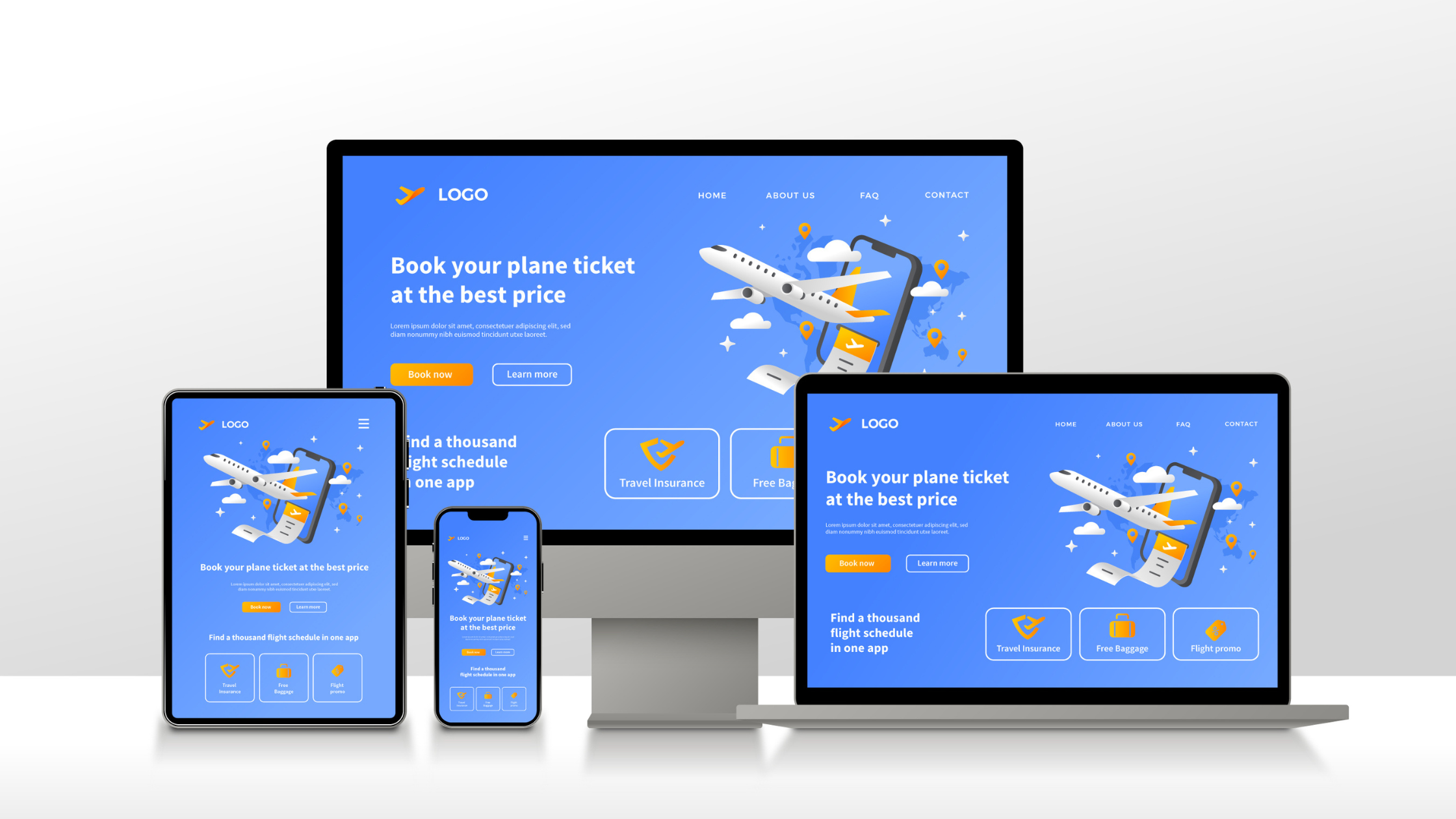
Responsive design in web development simply means keeping a site working well on different devices and window or screen sizes. A single website changes the layout and its elements depending on screen size and orientation to provide an optimum view.
Key Components of Responsive Design:
Fluid Grids: These enable the resizing of a layout depending on the size of your screen. The elements are measured in proportion, not as fixed-pixel sizes.
Flexible Images: Image size gets scaled relatively to its parent element so that it can remain in the parent container and not overflow on small devices or screens.
Media Queries: These are certain CSS techniques that apply different styles depending on the characteristics of a device, like the width of the screen, height, and resolution of the screen.
Importance of Mobile First Web Development
What is Mobile-First Development?
Under this strategy, a web designer or developer will begin by developing a website targeted at mobile devices with the smallest screen size first. Then, it progressively enhances it for larger screens, making sure it runs well on mobile devices before shifting focus to tablets, laptops, and finally desktop computers.
Enhanced User Experience: Users on mobile devices can navigate and interact with the website easily.
Faster Performance: Because mobile-first sites need to be ultra-light and highly optimized out of the box, they usually load faster.
SEO Benefits: While most search engines, such as Google, have started giving more significance and preference to mobile-friendly websites, they can increase ranking and even improve their visibility.
Best Practices for Responsive Design:
Prioritize Your Content: Consider what information is most vital to be able to see on each device.
VR Scalable Vector Graphics: These Vector Graphics scale out without any reduction in quality, thereby proving perfect for responsive designs.
Mobile First Development Tips:
Smoother Navigation: ensures that navigation menus perform well on smaller displays, often altogether collapsible or hamburger menus with back-a-step functionality
Touch–friendly design: provide buttons and links enough space so that they can be easily tapped using a finger.
SVGs—meaning the graphics are scalable without loss of quality and perfect for responsive designs.
Optimize Images: Compress images, implement responsive images, and load only the image size that fits best on a device.
Mobile-First Development Tips:
Simplify Navigation: Ensure that navigation menus are easy to use on smaller screens, often employing collapsible or hamburger menus.
Touch-Friendly Design: Make buttons and links large enough to be easily tapped with a finger.
Test Across Devices: Regularly test your website on various devices to ensure consistent performance and appearance.
Comprehensive Courses:
Oxdu Demand School offers a range of web development courses in Kondotty, including AI+ Digital Marketing, AI+ Python Fullstack Development, and AI+ Graphic Designing. Our curriculum is designed to equip students with the latest skills and knowledge in the industry.
Experienced Teachers:
Get admission to study under highly knowledge-rich teachers in their respective subjects and avail rich practical experience and insights from them while teaching. Provides valuable guidance and mentorship.
Hands-on Training:
Web development training in Kondotty focuses on practical, hands-on training. Students shall be working on live projects, and at the end of the training, they will have learned all the skills that are deployed in the industry.
Conclusion
Responsive designs and mobile-first approaches to web development are some of the most important practices used by contemporary web developers to ensure optimal user experience across all devices, improve performance, and boost SEO rankings. Located in Kondotty, Oxdu Demand School offers cutting-edge web development courses with training that will help you build a successful career in this fast-moving area. Enrol now; take your first step into the future of web development.
For more information about our web development courses in Kondotty and enrollment may visit our website or personally contact us. Build your journey to be a skilled web developer here at Oxdu Demand School.